- These list items are microformat entries and are hidden from view.
- https://dltj.org/article/some-navel-gazing/
- I usually don't post about the act of blogging itself (I wonder how many middle-aged blogs have a similar post), but the confluence of a couple of things caused me to look at DLTJ with a critical and curious eye. The first was the work by David Pattern in Measuring the emotional content of librar* blogs. The second was a post by Leslie Carr on the effect of Google users in finding information.ANEW Categorization [caption id="attachment_876a" align="alignright" width="240" caption="Figure 1. Graphic showing the ANEW quadrants."][/caption] David Pattern added a feature to his HotStuff 2.0 ("…keeping track of what’s cooking in the biblioblogosphere") that graphs the cumulation of a blogs post against the “affective norms for English words” (ANEW). (A topic, surprisingly, that does not have an entry on Wikipedia.) ANEW is a list of "just over a thousand words, along with a measure of their 'pleasure' and 'arousal' values", and the resulting graph shows a characterization of tendencies to use words used: towards the top are weaker emotions, towards the bottom are stronger ones; to the left are words with negative emotion, to the right are words with positive emotions. It looks like the graph in figure 1.Each night, HotStuff 2.0 recalculates this and other factors on the blog's page; for instance, mine. If I overlay the emotional analysis graph with the template in figure 1, I get this:[caption id="attachment_876b" align="aligncenter" width="600" caption="Figure 2. ANEW Analysis of DLTJ"][/caption]The gray circles represent words found in the ANEW list; the larger the circle, the more often I used the word. The smaller green marks are the average emotional content of each blog post; the large red mark is the average of all of the ANEW word choices across all posts in DLTJ.[caption id="attachment_876c" align="alignright" width="240" caption="Figure 3. Just over 24,000 blog posts plotted by their average emotional content show that the majority of the posts contain positive emotional content."][/caption] Not surprisingly, I suppose, the emotional word choice of DLTJ is not unlike the biblioblogosphere tracked by HotStuff 2.0 (as showing in figure 3). I wonder if this is a reflection of the profession in general: an emotional state that I would characterize as guardedly optimistic. On the other hand, the DLTJ graph seems basically in line with any bias built into the model. I think this is generally showing that I'm a balanced with a slight leaning towards positive yet neutral-toned blogger. Yeah, that sounds about right; I think I'm that way in real life, too. What more would you expect from the court jester?References from Google QueriesLeslie Carr notes something that we intuitively (or perhaps even objectively) know -- most Google users do not look past the first page of search results. In Carr's case, he is talking about the impact of Google indexing and search queries on finding rich quantities of information in EPrints repositories. His post, though, made me look at how search engines and their users see the DLTJ content. Using the Google Webmaster Tools, for instance, has a Top search queries report (figure 4) that shows "which search queries most often returned pages from your site, and which of them were clicked."[caption id="attachment_891" align="aligncenter" width="841" caption="Figure 4. Google Webmaster Toolkit Top Searches report for DLTJ covering April 1-15, 2009."][/caption]In comparing the left side with the right side, I think this report from Google is showing that far more people actually get to DLTJ from the first page of search results (the right side) than where DLTJ actually appeared in common search terms (the left side). What this really points out, though, is a couple of odd-ball posts that -- by whatever magic relevancy ranking Google does -- are top hits. For instance, a search for why fedora brings back two pages near the top of the search results dating back to the time when OhioLINK was pursuing the Fedora digital repository software (not Fedora the operating system, which is what I expect most people are looking for). Another one is a one-off post in which I took a swipe at U.S. Airways for their poor customer service; that post ranks high in a Google search for U.S. Airways phone numbers -- something that they can't be too happy about. Perhaps the weirdest one is showing up in search results for the phrase "Show me the money" -- in a post where I rant a bit about how open source projects should "Show us the code!"Well, enough of this. We now return you to your irregularly scheduled blog content.The text was modified to remove a link to http://www.daveyp.com/hotstuff/?p=232 on November 13th, 2012.The text was modified to remove a link to http://www.daveyp.com/hotstuff/ on November 13th, 2012.The text was modified to remove a link to http://www.daveyp.com/hotstuff/blogs/6721291 on November 13th, 2012.The text was modified to remove a link to http://www.daveyp.com/hotstuff/?p=232 on November 13th, 2012.The text was modified to remove a link to http://www.daveyp.com/hotstuff/?p=244 on November 13th, 2012.The text was modified to remove a link to http://www.daveyp.com/hotstuff/blogs/ on November 13th, 2012.
- 2009-04-21T01:29:23+00:00
- 2018-01-15T20:47:28+00:00
Some Navel-Gazing: A Meta-Post about DLTJ
I usually don't post about the act of blogging itself (I wonder how many middle-aged blogs have a similar post), but the confluence of a couple of things caused me to look at DLTJ with a critical and curious eye. The first was the work by David Pattern in Measuring the emotional content of librar* blogs. The second was a post by Leslie Carr on the effect of Google users in finding information.
ANEW Categorization
[caption id="attachment_876a" align="alignright" width="240" caption="Figure 1. Graphic showing the ANEW quadrants."]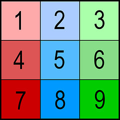 [/caption] David Pattern added a feature to his HotStuff 2.0 ("…keeping track of what’s cooking in the biblioblogosphere") that graphs the cumulation of a blogs post against the “affective norms for English words” (ANEW). (A topic, surprisingly, that does not have an entry on Wikipedia.) ANEW is a list of "just over a thousand words, along with a measure of their 'pleasure' and 'arousal' values", and the resulting graph shows a characterization of tendencies to use words used: towards the top are weaker emotions, towards the bottom are stronger ones; to the left are words with negative emotion, to the right are words with positive emotions. It looks like the graph in figure 1.
Each night, HotStuff 2.0 recalculates this and other factors on the blog's page; for instance, mine. If I overlay the emotional analysis graph with the template in figure 1, I get this:
[caption id="attachment_876b" align="aligncenter" width="600" caption="Figure 2. ANEW Analysis of DLTJ"] [/caption]
The gray circles represent words found in the ANEW list; the larger the circle, the more often I used the word. The smaller green marks are the average emotional content of each blog post; the large red mark is the average of all of the ANEW word choices across all posts in DLTJ.
[caption id="attachment_876c" align="alignright" width="240" caption="Figure 3. Just over 24,000 blog posts plotted by their average emotional content show that the majority of the posts contain positive emotional content."]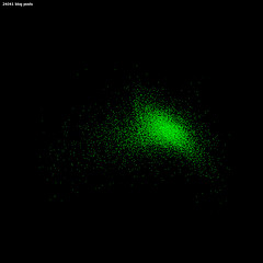 [/caption] Not surprisingly, I suppose, the emotional word choice of DLTJ is not unlike the biblioblogosphere tracked by HotStuff 2.0 (as showing in figure 3). I wonder if this is a reflection of the profession in general: an emotional state that I would characterize as guardedly optimistic. On the other hand, the DLTJ graph seems basically in line with any bias built into the model.
I think this is generally showing that I'm a balanced with a slight leaning towards positive yet neutral-toned blogger. Yeah, that sounds about right; I think I'm that way in real life, too. What more would you expect from the court jester?
References from Google Queries
Leslie Carr notes something that we intuitively (or perhaps even objectively) know -- most Google users do not look past the first page of search results. In Carr's case, he is talking about the impact of Google indexing and search queries on finding rich quantities of information in EPrints repositories. His post, though, made me look at how search engines and their users see the DLTJ content. Using the Google Webmaster Tools, for instance, has a Top search queries report (figure 4) that shows "which search queries most often returned pages from your site, and which of them were clicked."
[caption id="attachment_891" align="aligncenter" width="841" caption="Figure 4. Google Webmaster Toolkit Top Searches report for DLTJ covering April 1-15, 2009."] [/caption]
In comparing the left side with the right side, I think this report from Google is showing that far more people actually get to DLTJ from the first page of search results (the right side) than where DLTJ actually appeared in common search terms (the left side). What this really points out, though, is a couple of odd-ball posts that -- by whatever magic relevancy ranking Google does -- are top hits. For instance, a search for why fedora brings back two pages near the top of the search results dating back to the time when OhioLINK was pursuing the Fedora digital repository software (not Fedora the operating system, which is what I expect most people are looking for). Another one is a one-off post in which I took a swipe at U.S. Airways for their poor customer service; that post ranks high in a Google search for U.S. Airways phone numbers -- something that they can't be too happy about. Perhaps the weirdest one is showing up in search results for the phrase "Show me the money" -- in a post where I rant a bit about how open source projects should "Show us the code!"
Well, enough of this. We now return you to your irregularly scheduled blog content.
The text was modified to remove a link to http://www.daveyp.com/hotstuff/?p=232 on November 13th, 2012.
The text was modified to remove a link to http://www.daveyp.com/hotstuff/ on November 13th, 2012.
The text was modified to remove a link to http://www.daveyp.com/hotstuff/blogs/6721291 on November 13th, 2012.
The text was modified to remove a link to http://www.daveyp.com/hotstuff/?p=232 on November 13th, 2012.
The text was modified to remove a link to http://www.daveyp.com/hotstuff/?p=244 on November 13th, 2012.
The text was modified to remove a link to http://www.daveyp.com/hotstuff/blogs/ on November 13th, 2012.
