Test Driving Lumifi
Earlier this week, Lumifi Inc. announced a new version of their research platform "to better serve students, professionals and others in dealing with information overload." Lumifi is a private corporation based in Maryland, and this is their second major release of their service. (The first was announced in January 2008.) I didn't see the first interface so I can't compare it to the earlier effort, but on the whole I am unimpressed. There may be some new magic happening behind the scenes here, but it is hidden in an awful interface that is very difficult to get past.
This is what Lumifi has to say about itself:
Lumifi's contextual analysis system represents a major advancement in web and document research technology. At the heart of the system is the Synapse engine, a proprietary software technology that analyzes content to find connections and relationships between words using statistical semantic analysis. By aggregating and analyzing these relationships, Synapse produces highly targeted, contextual insight that is not possible with traditional indexing or search applications.
At its core, Synapse's analysis is the product of two code paths – a data-mining engine and semantic analysis engine. They work in concert to find the most statistically significant topics, sentences and paragraphs from unstructured text. These engines include a number of sophisticated algorithms and components, including a stream-capable sentence and phrase parser, a statistical keyword and keyphrase analyzer, a semantic network optimizer and a real-time context generator.
I took it for a test drive, and spent much of my time trying to figure out how the interface works.
Trying It Out
Screencast recording of the Lumifi testdrive (approx. 7 minutes). Also available for download in Flash format.
One needs to register for a free account in order to put Lumifi through its paces. (There are canned searches on the home page that one can try -- "Global Warming" and "The Origin of Species by Charles Darwin" -- but one can only affect the ranking and weighting of results.) The interface comes with no documentation, tool tips, or other clues as how to exploit it, so it is entirely possible that I'm missing some of the power of the interface. 
One can input in a "Focus" term (also interchangeably called a "Skewing Term" it would appear) and the search results on the right side change. The Summary, Best Results, and Topics don't change, though. This seems to be a weak form of limiting, but the results are not very satisfying because it only affects one portion of the results.
There are options in the Summary box to "Copy summary", "Copy website(s)," and "Copy note(s)" but the options don't appear to do anything. They certainly don't put data on the computer's clipboard that can be pasted into another application. In fact, many of the functions assume that Lumifi will be the center of the universe. One can upload documents to the site, but that seems to have limited value other than just storing them in Lumifi.
Lumify - The Technology
Quoting several paragraphs from the "Lumifi Technology" panel of the flash applet:
Utilizing an advanced service-oriented architecture (SOA), Lumifi is both scalable and easily extendable. Lumifi is developed in accordance with industry best practices and leverages standards and open source software from across the computing platform. These include: XML for the API, JAAS for authentication, J2EE for scaleability and portability, SQL for universal database support, JMS for activity monitoring, and Adobe Flex for the rich user interface. The adherence to standards allows Lumifi to be effortlessly installed in the enterprise, either using the open source components that Lumifi currently leverages or using other standards-supporting technologies that the enterprise may currently license.
This all sounds good. J2EE is a Java-based standard for deploying server applications across many computing environments. JAAS and JMS are standards within the Java community for J2EE applications. SQL is the standard language for relational databases, so it sounds like the Lumifi application will use everything from the freely available MySQL and Postgresql databases up to the proprietary Oracle and DB2.
Although, Lumifi contains a rich, brandable, user interface based on the Adobe Flex technology, Lumifi's XML/REST-based architecture allows Lumifi services to be embedded in any internet-aware technology. Lumifi implements a simple yet powerful security model that allows for user authentication, document sharing and intuitive access controls.
I'm going to take Lumifi to task below for its use of Flex/Flash as the primary demonstration interface to the technology. In short, Flex/Flash results in a clunky, if glitzy, user interface. The mention of "XML/REST-base architecture", though, gives one hope that the Lumifi-supplied interface can be thrown out entirely and embedded in more traditional interface designs. There isn't any documentation or other examples, though, of the XML/REST interface.
Lumifi's unique architecture allows features to be easily added and extended; any feature can be provisioned based on any aspect of a user's profile. This permits Lumifi to enable features on an individual basis, on a class basis, or even on a demographic basis. Accordingly, Lumifi can target features to users according to virtually any criteria.
With limited information about how it could be extended, it is difficult to judge how easily it could be extended.
Lumifi - The User Experience
Although the underlying technology may be based on sound principles of an open architecture, the way they decided to show it off is anything but open from a technological perspective. That is, the user interface is based entirely on a 1MB Flash applet downloaded to the browser that is scaled to fit the entire screen. This is wrong on so many levels it is hard to know where to start:
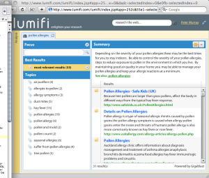
- It violates the principles of the Web Architecture. You know how you usually can bookmark a page and return to that exact spot of your discovery process later? Or how you can share a URL with someone and know that they are seeing exactly what you are seeing? That is how the web works -- how it is architected. The web architecture is based on the notion that the context embodied in a URL is all you need to get back a page. Lumifi has chosen to go outside the web architecture by embedding all of the context in the flash applet. They appear to be exploiting some Flash tricks to change the URL somewhat (after searching for "pollen allergies" above the URL change to http://www.lumifi.com/lumifi/index.jsp#app=252c&55e1-selectedIndex=2&57ec-selectedIndex=0&8ba-selectedIndex=0&9c53-selectedIndex=0&dadc-selectedIndex=0&e0fb-selectedIndex=0). The changes are in the fragment portion of the URL, but this doesn't seem to be an appropriate place to put server-side state. In particular, the URLs don't work if you aren't actually signed into the Lumifi system. (You just see the front page with no indication as to the special nature of the URL.)
- The applet assumes a large window size.

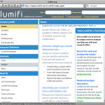
Example of a Lumifi window that is cropped because the browser window is not large enough. I was initially hampered by the fact that my browser window size was not set to the maximum. There were parts of the flash applet that I could not see because my window wasn't large enough. Based on some experimentation, it looks like the applet assumes that your browser window will be taller than about 680 pixels and wider than about 762. If it isn't, you'll not only loose information (such as the bottom-most links in the left navigation panel), but you also get dueling scroll-bars, as in the middle and right panels. - The applet is huge. There is no real indication as to what is going on while it is loading, and a number of times I've thought the site itself was down because the only thing I was seeing was a blank screen. 1MB, even in today's predominantly broadband internet days, is still quite big.
The interface itself is very confusing. I found that options are hidden behind nondescript icons and that the site design deviates enough from user interface conventions that it makes the service hard to use. Other parts of it seem to be broken, like the fact that it remembered I had set a focus/skewing term of trees even after I had cleared it. Or that adding a focus/skewing term didn't change the topics listed in the left column of the display.
In addition to all of that, the Flash applet seems to needlessly command the attention of the computer's processor -- even when it isn't doing anything. (There is no network activity that I can determine when idle -- it just forces the browser to consume about 40% of an otherwise idle CPU.) This is true at least on a Mac PowerBook using the Safari browser.
Some Conclusions
At this point, I think it is "Please Move On; Nothing to See Here." From an OhioLINK perspective, it may be possible to use this as an enhanced search engine that is inferring relationships between journal articles in our Electronic Journal Center, book chapters in our Electronic Book Center, and items in the Digital Resource Commons. There is no mention of the capacity limits of the system, however, and to cover all of that OhioLINK content would require an engine capable of handling several tens of millions of objects. A Google search for "pollen allergies" returns 1.7 million hits; the Lumifi search returns 39 "most relevant". It is impossible to know whether the smaller number is due to a more advanced relevance ranking or simply a limited pool of possible results.
More to the point, I can't envision keeping my research in Lumifi -- especially given that I can't edit documents, build bibliographies, or perform other necessary research options. On the search screen, the "Topics" may be semantically derived based on the results of the initial search, but there are other engines that do the same. There might be good technology here, but it is very hard to find it given their choice to use a full-window Flash applet as its delivery mechanism. It would certainly take more follow-up with them, and more information other than flowery phrases in the service itself ("wow professors with the depth and substance of your knowledge" and "add credibility to your paper or project with citable resources"). At this point I don't believe it would be worth the effort.
If anyone else tries out Lumifi and comes to different conclusions, please let me know.
The text was modified to remove a link to http://www.lumifi.com/lumifi/index.jsp#app=252c&55e1-selectedIndex=2&57ec-selectedIndex=0&8ba-selectedIndex=0&9c53-selectedIndex=0&dadc-selectedIndex=0&e0fb-selectedIndex=0 on February 11th, 2011.
The text was modified to update a link from http://gbiv.com/protocols/uri/rfc/rfc3986.html#fragment to http://tools.ietf.org/html/rfc3986#section-3.5 on November 13th, 2012.