- These list items are microformat entries and are hidden from view.
- https://dltj.org/article/tweeking-friendfeed/
- FriendFeed went live yesterday with changes to the user interface and back-end systems. The changes were moderately positive, taken as a whole, but there are aspects of the new user interface that I don't like -- the color scheme, the removal of the service icons, and the (over)-use of whitespace. Fortunately, with Firefox plus a few extensions as my primary browser, I'm able to tweak the interface to be closer to my liking. If your tastes resemble mine, I both feel sorry for you and want to help you improve your view of FriendFeed.
- 2009-04-30T20:15:59+00:00
- 2018-01-15T20:47:28+00:00
Tweaking the New FriendFeed Interface
FriendFeed went live yesterday with changes to the user interface and back-end systems. The changes were moderately positive, taken as a whole, but there are aspects of the new user interface that I don't like -- the color scheme, the removal of the service icons, and the (over)-use of whitespace. Fortunately, with Firefox plus a few extensions as my primary browser, I'm able to tweak the interface to be closer to my liking. If your tastes resemble mine, I both feel sorry for you and want to help you improve your view of FriendFeed.
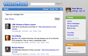
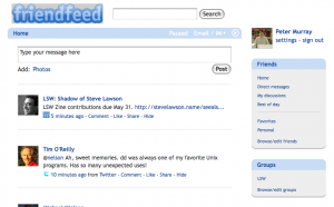
[caption id="attachment_915" align="alignright" width="300" caption="FriendFeed interface before and after changes via Greasemonkey and Stylish"]
 [/caption]
The primary tool to help with the user interface changes, in addition to using Firefox, is the Greasemonkey extension. After installing this extension, you can use "scripts" to tell the browser to change the HTML markup of any arbitrary web page as it is being loaded. A secondary tool is the Stylish extension. Stylish does to a pages CSS code what Greasemonkey does to the HTML -- it overrides the page author's styles and substitutes your own. Stylish is actually optional because you can use Greasemonkey to load a form of Stylish scripts to accomplish the same outcome. (Some Greasemonkey scripts also work in the Opera browser; I haven't tried the scripts listed here, so your mileage may vary.)
The first thing we want to do is bring back the service icons. These are the 16x16 pixel graphics that show the source of the entry in the FriendFeed stream. I haven't heard a good explanation from the FriendFeed developers as to why they took this out, but I find it to be a key factor in how I scan through the FriendFeed stream. Fortunately, Chris Peoples wrote a Greasemonkey script to bring them back. Simply install the script and reload the FriendFeed page; the service icons will be back for public entries. (As Chris notes, it doesn't work on private feed entries.)
The second thing we want to do is clean up the color scheme: remove the grey background, de-emphasis the functional areas on the right, and rebalance the font sizes. AJ Batac wrote a Stylish script that does that and more. You can load this script into Stylish or apply the Greasemonkey version; as far as I know, they are equivalent. In addition to the color schemes, this script adds new functionality: highlighting friend comments in a light yellow background and highlighting your comments with a light blue background. The latter is particularly useful for rescanning a conversation where you have made a comment; the light blue background tells you exactly where your comment is in the conversation and the new comments that followed.
There is a third script that removes the large avatars that came with the new interface design. Personally, the avatar graphics don't bother me, but if you want to remove those, you have that option, too.
The text was modified to update a link from http://www.opera.com/browser/tutorials/userjs/examples/#greasemonkey to http://web.archive.org/web/20090530/http://www.opera.com/browser/tutorials/userjs/examples/#greasemonkey on August 22nd, 2013.
The text was modified to update a link from http://www.opera.com/browser/tutorials/userjs/ to http://web.archive.org/web/20090530/http://www.opera.com/browser/tutorials/userjs/ on August 22nd, 2013.
